This article provides users with a general guide to the features listed.
These features may have been updated or superseded by additions found in the release notes.
Read the content below to become familiar with the feature and review the release notes to get the latest iteration.
Google BigQuery Geographic Information Systems enables users to analyze location information data such as longitude and latitude. BigQuery GIS offers SQL geography functions on geography data types to assist the user in analyzing location data.
Goliath supplements BigQuery GIS by visualizing location data via interactive maps using Leaflet.
The following sections will introduce and describe BigQuery GIS visualization in Goliath.
For more information on Google BigQuery GIS including tutorials and functions visit BigQuery documentation below:
Getting started with BigQuery GIS for data analysts
Geography Functions in Standard SQL
Introduction
Location data can be visualized in different vector formats such as points, multi-points, lines, polyline, and polygons.
| Point, Multi-point | Point represented in latitude and longitude. | 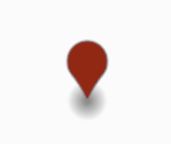 |
| Line, Polyline | Line representation between location data. | 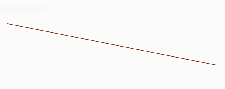 |
| Polygon | Polygon representation of geography data. | 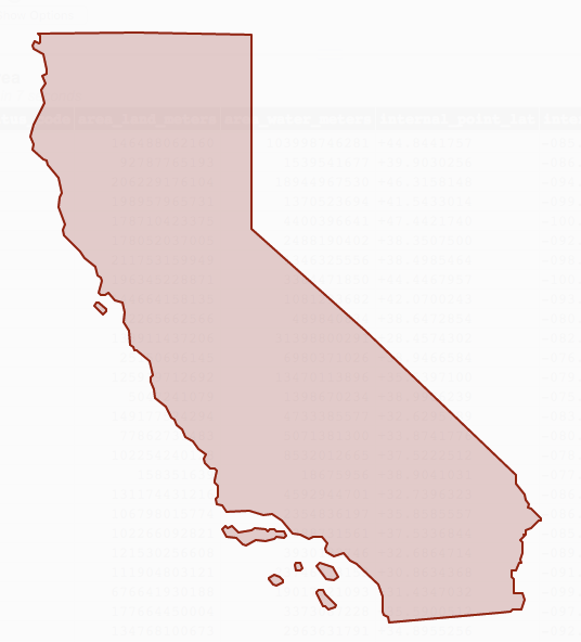 |
Data location is represented by geography data type.
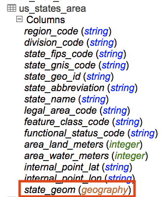
Public datasets with geography data types can be found in project Bigquery-public-data. Utility_ue and utility_us are examples of datasets containing geography data type.
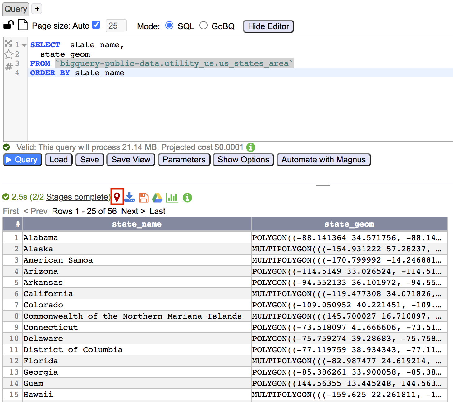
Data with geography data type can be visualized within Goliath. To visualize data
Either
- Return query results that contain geography data type.
- Click on the Open Geo Visualization icon

Or
- Return query results that contain geography data type.
- In query result window double click on query result table to open JSON viewer.
- Within JSON viewer navigate to column with geography data type.
- Visualization menu options become available for geography data types.
JSON Viewer Geography Data Type Menu
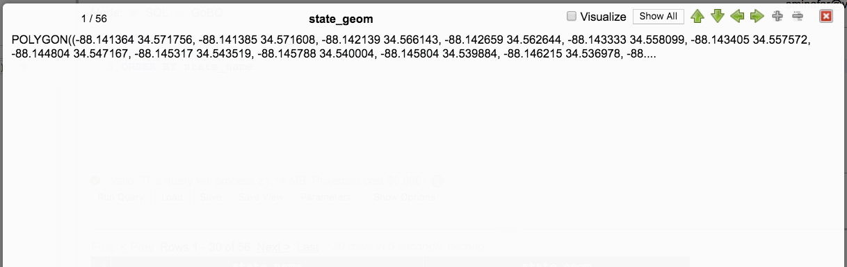
Geography Data Type Menu options include Visualize and Show All.
- Visualize renders the rows geography data types and displays the visualization settings.
- Show All displays all of the geography data text. Because geography data text may be large the text is initially truncated. Clicking Show All will display the full text. Clicking Show Less will show the truncated text.
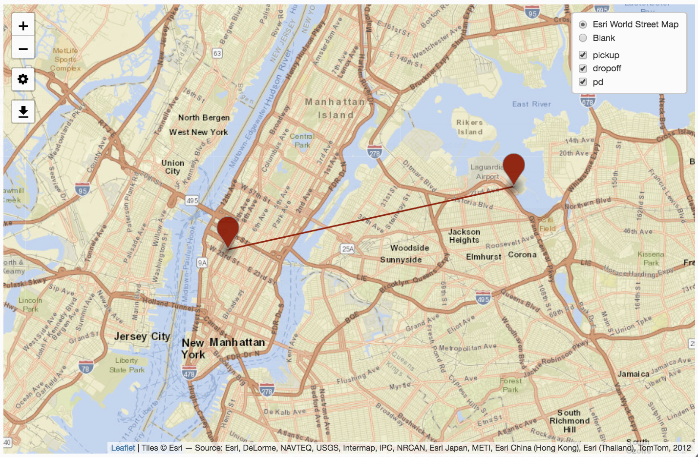
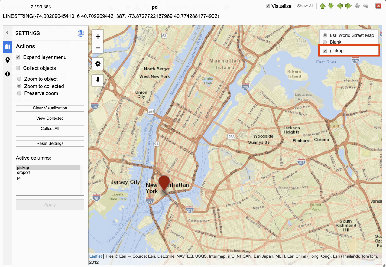
Visualization Menu
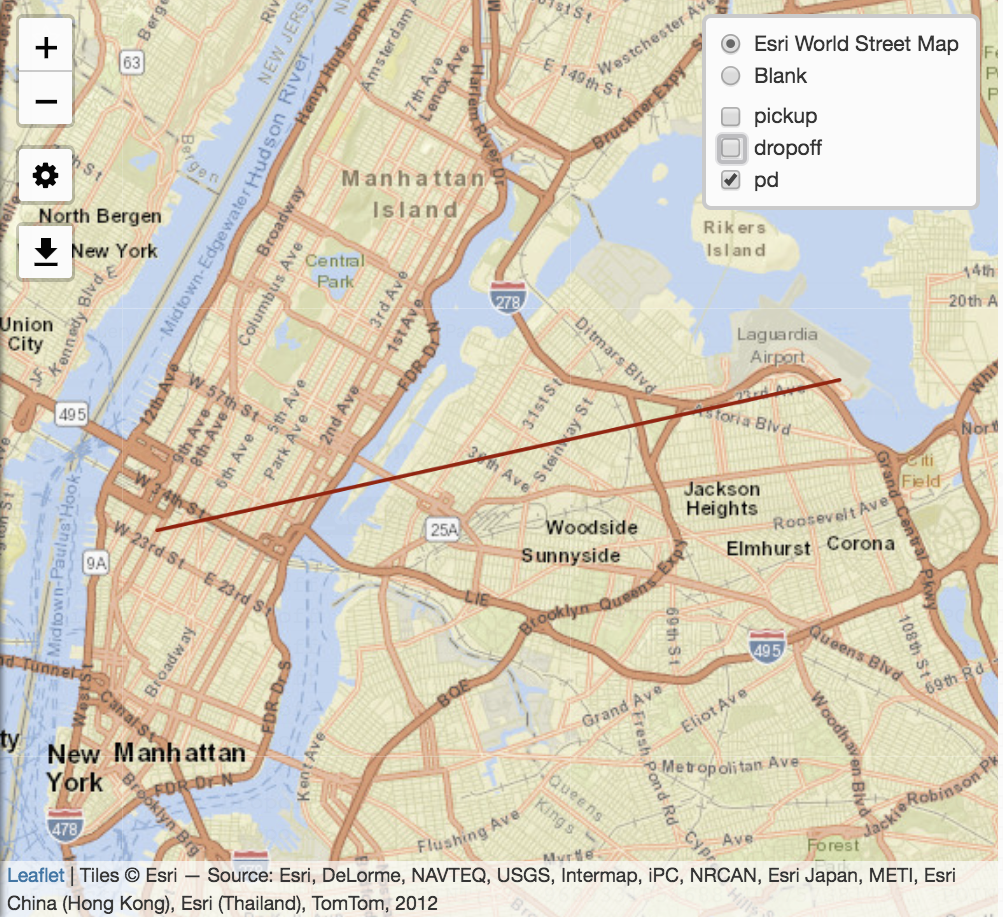
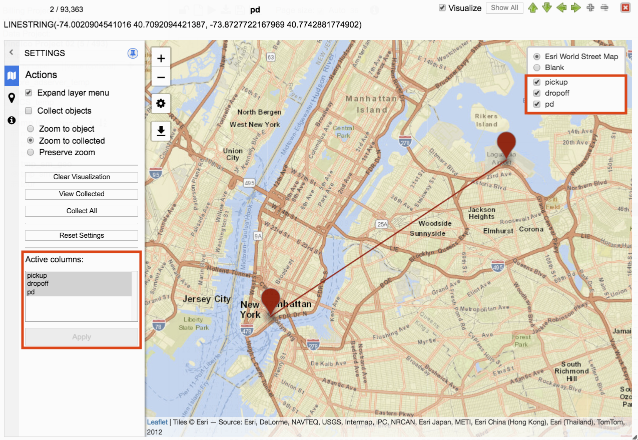
Clicking on Visualize from the JSON Viewer on a geography data type will display the visualization along with settings menu.

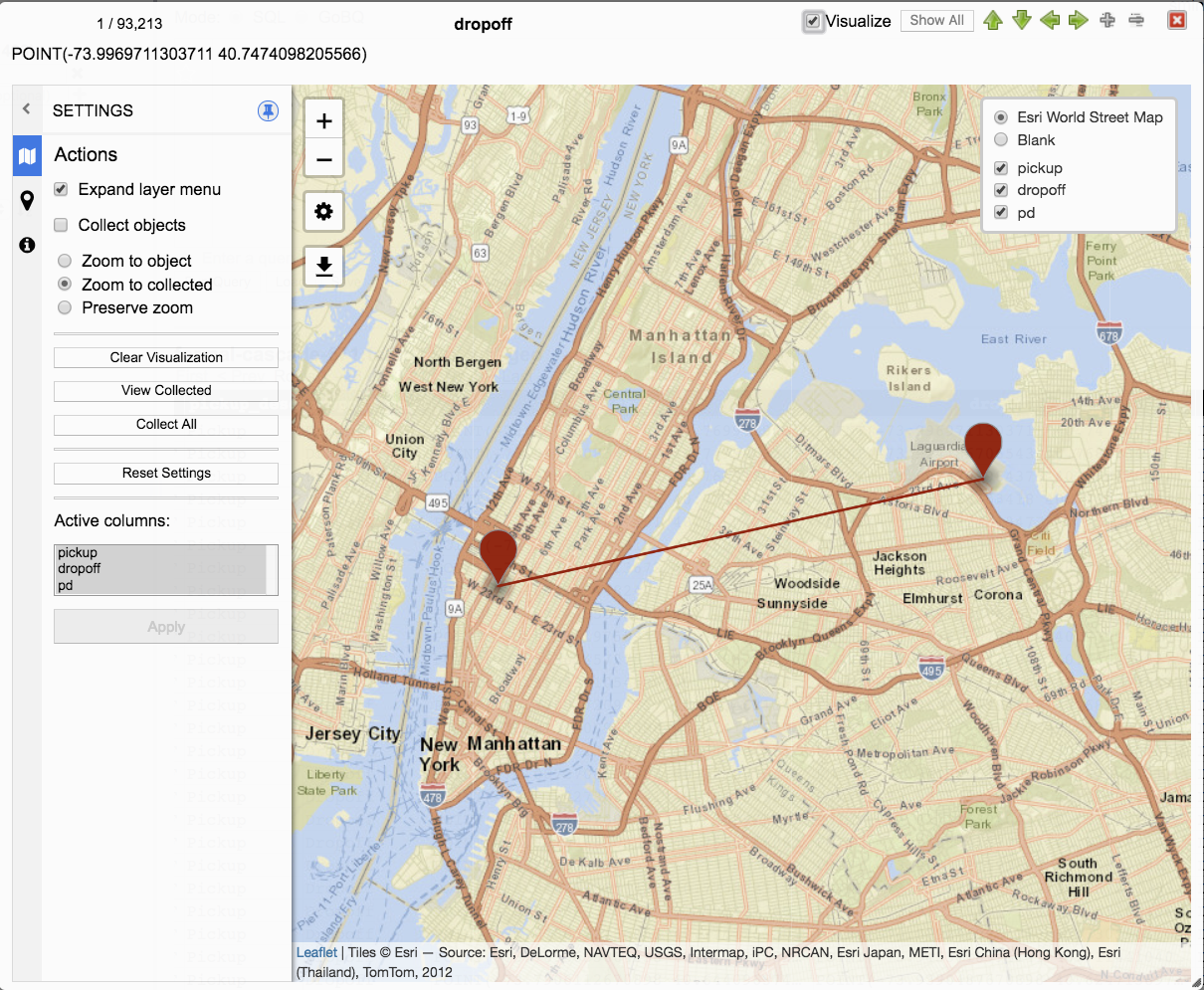
All of the geography data types for the current row are rendered in the visualization.
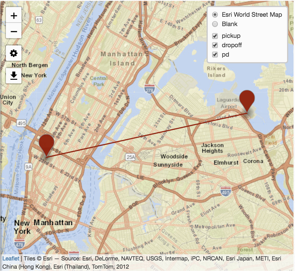
The visualization includes a layer menu, settings, zoom in and zoom out, download, and visualization panel.
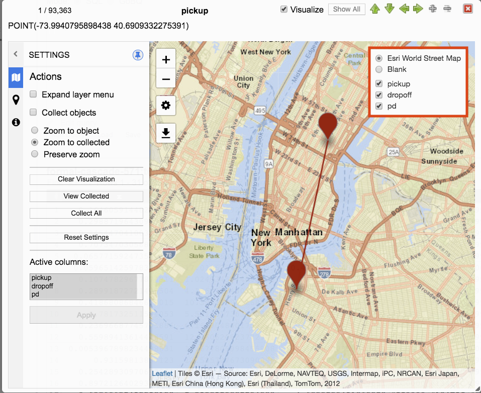
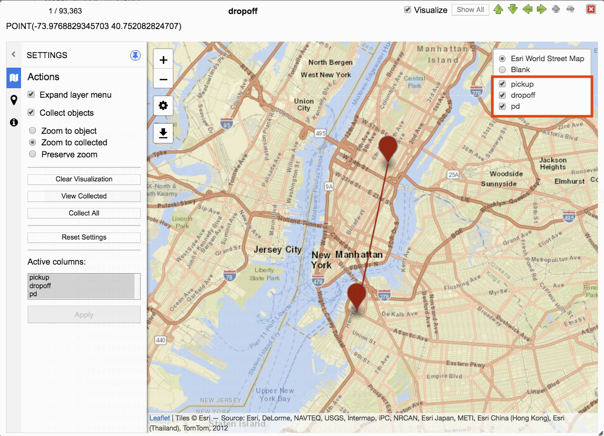
Layer Menu
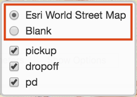
The layer menu contains both the visualization provider and the layers represented in the visualization.
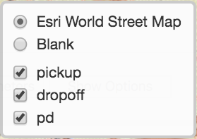
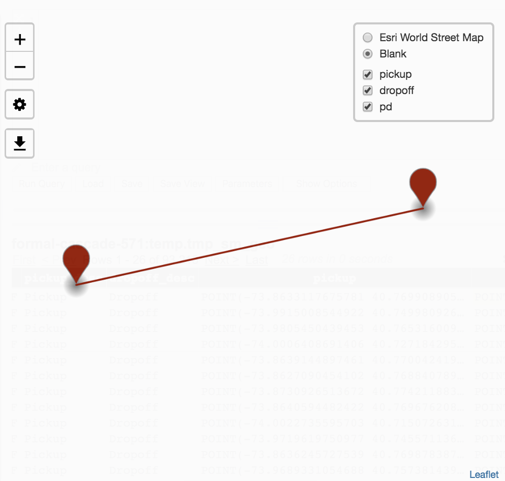
Visualization providers include Esri World Street Map and Blank.
Esri World Street map offers a rich map visualization that can be zoomed out to global and zoomed in to street level.
Blank displays only the layers representation of location data.
Visualization layers include all layers available for visualization. Layers are visualized through viewing query result rows in the JSON viewer, navigating the JSON viewer, and selecting Collect objects and Collect All from the menu settings.
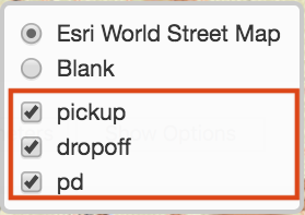
Unchecking a layer will remove visibility of that layer from visualization.
Checking a layer will display the layer in the visualization.
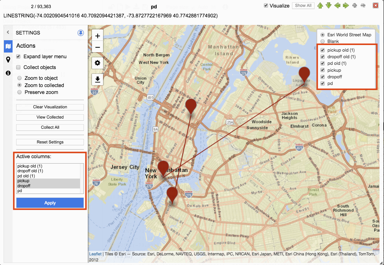
In this example all layers are visualized.

Unchecking pickup and dropoff removes those points from the visualization.
Zoom In/Out
The visualization panel can be manipulated with the mouse.
Left clicking the mouse and dragging will move the visualization.
To zoom in click on +. Each click will zoom in closer until min zoom is reached.
To zoom out click on -. Each click will zoom out further until max zoom is reached.
Settings Menu

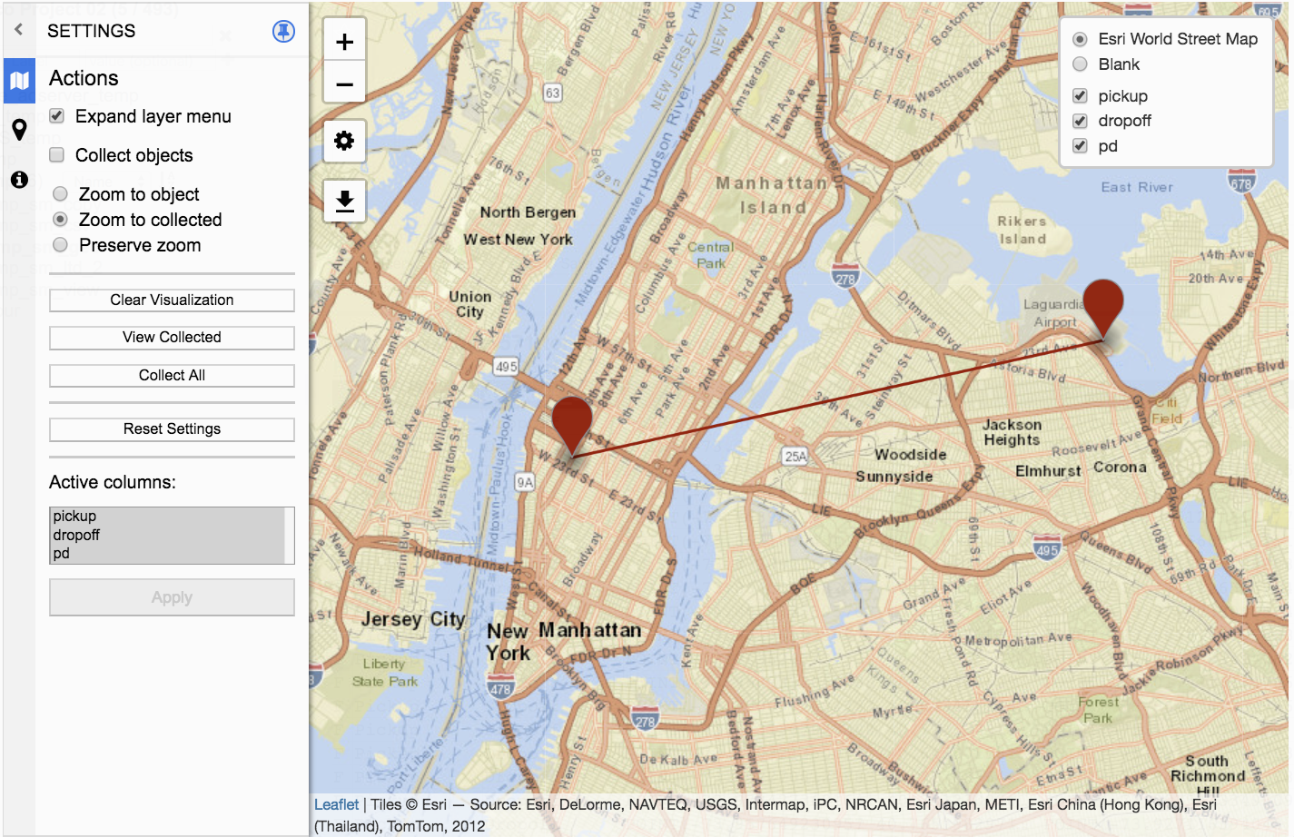
Visualization has a settings menu that offers a wealth of options for configuring visualization. Settings appear in a panel on the left of the JSON viewer window.
The settings panel visibility can be toggled by clicking on the Settings icon.
By default, the settings panel is displayed.
Clicking on the Settings icon will toggle the Settings panel visibility.
If the Settings panel is not visible, clicking on the Setting icon will display the Settings panel.
Download image

Visualizations can be downloaded by clicking on the Download Image icon.
Prepare the visualization by configuration settings and framing the area to download. The visualization that is displayed is the visualization that will be downloaded. When ready click on the Download Image icon.
After clicking on Download Image icon a snapshot of the visualization is transformed into an image (.png) and automatically downloaded locally. The file name is defaulted to visualization.png and each successive download will include an incremented number i.e. visualization (2).png.
Visualization Settings
Settings consist of three panels. These panels are Actions, Style, and Info.
Actions
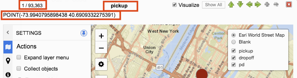
Actions provides expanding layer menu, collecting objects, zooming to objects, and selecting columns.
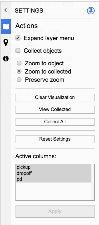
Expand layer menu
When checked, the layer menu remains expanded.
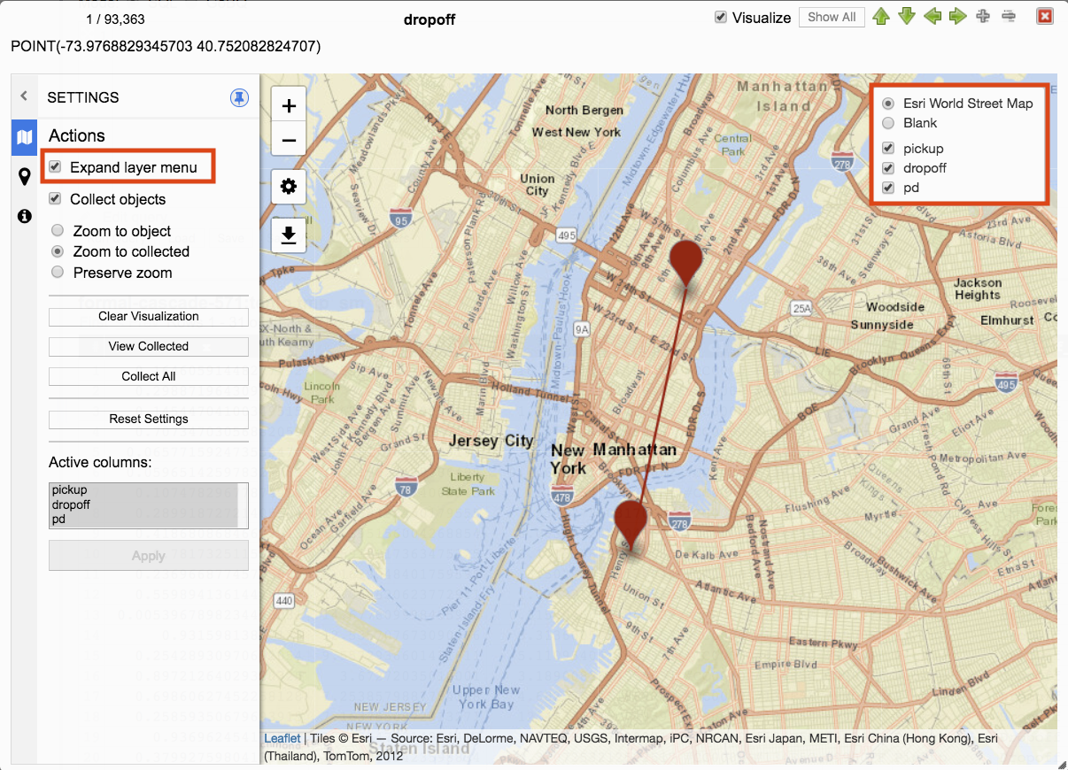
When unchecked the layer menu collapses.
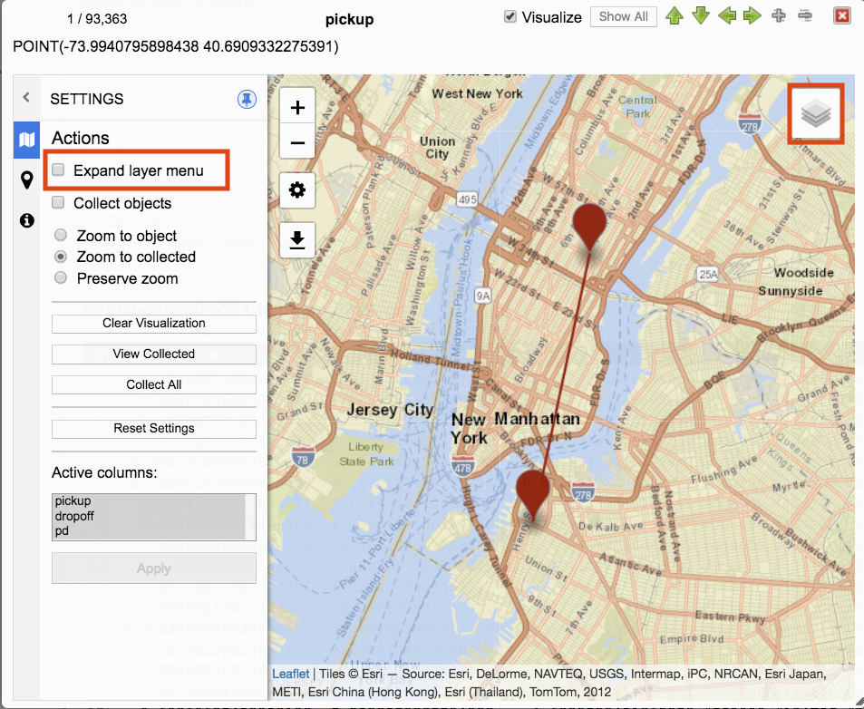
Hover the cursor over the collapsed layer menu to expand it.
Collect Objects
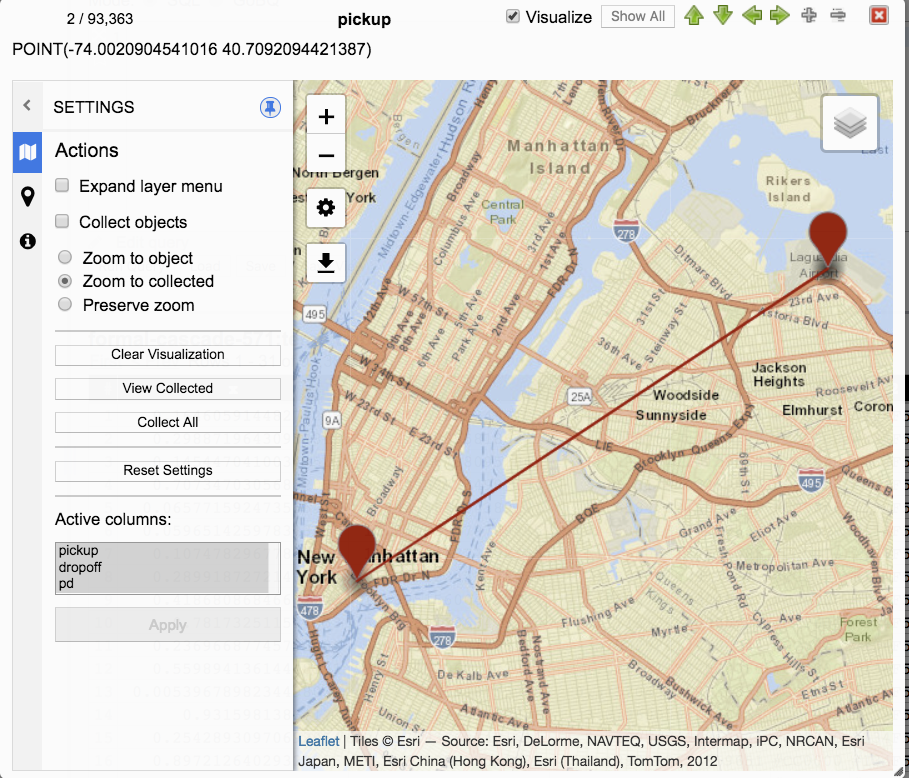
To visualize data, click on a geography data column from query results to open the JSON viewer. The JSON viewer will display data for the column along with an option from the menu to Visualize. Clicking visualize will visualize all geography data from the row that was selected.
Navigating Data
Query results that have multiple rows can be navigated by using the arrow keys from the keyboard or clicking on arrows within the JSON viewer.
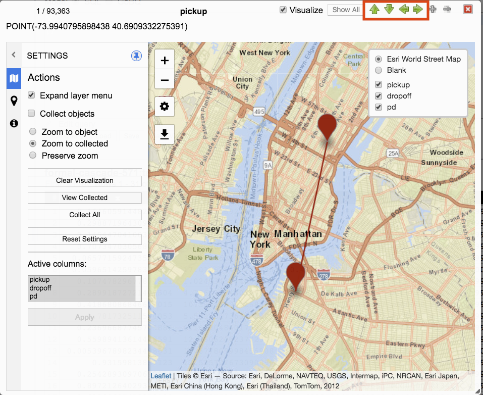
Navigating to a different row will visualize geography data of that row. The previous visualized geography data row will be removed from visualization.
Checking Collect objects will preserve visualization across rows and query results.
Navigating through rows while Collect objects is checked will add geography data to the visualization.
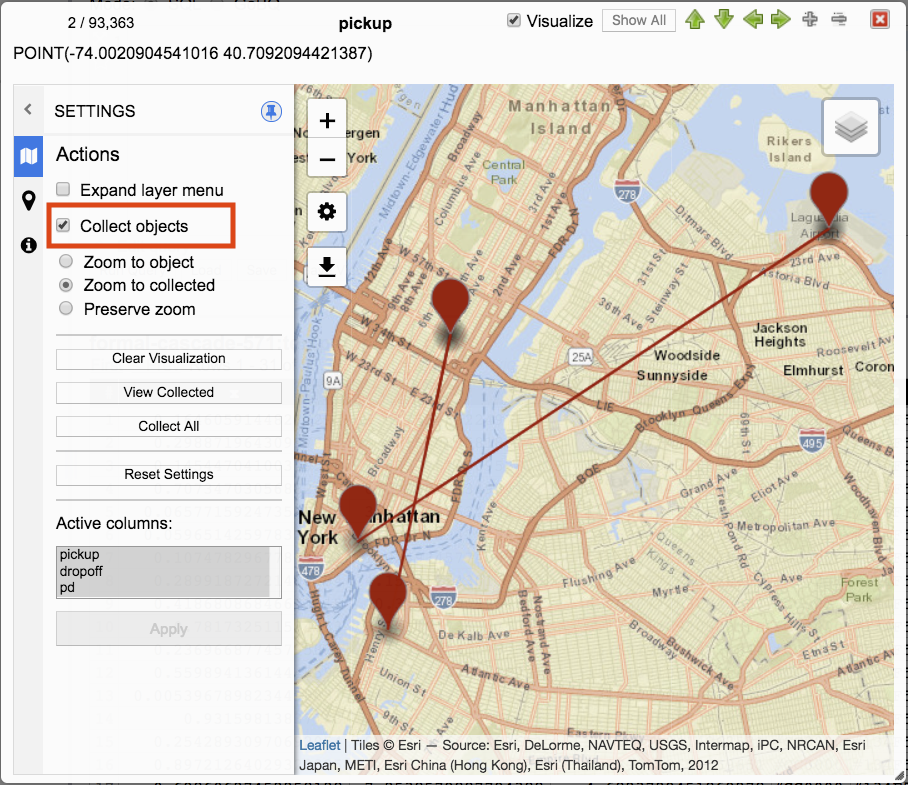
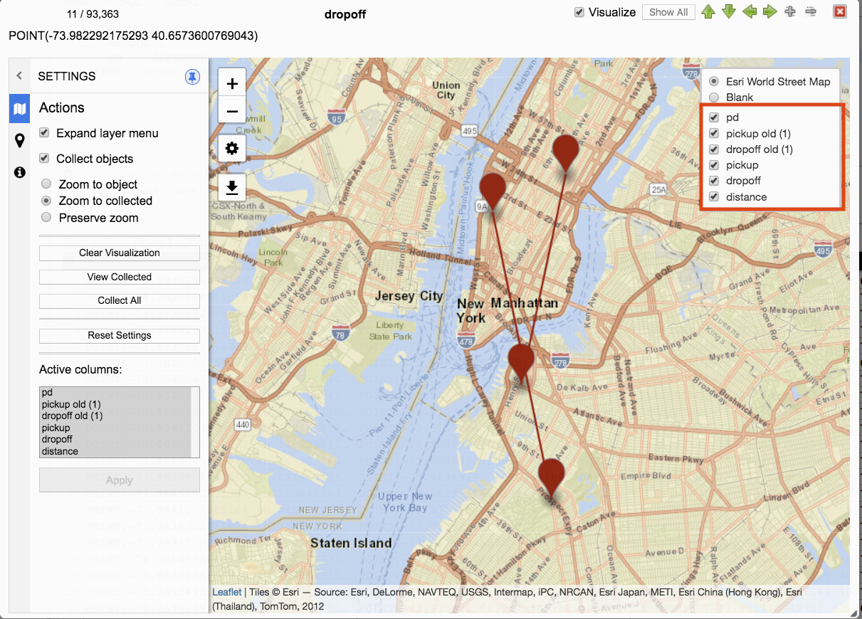
Running a new query while Collect objects is checked will add the new results to the visualization. Columns with the same name will be renamed. The previous query result column will be appended with old (#) where # is the number of previous query results with the same name.
For example, if a query result contained geography data columns named pickup, dropoff, and pd and then a new query was run with geography data columns named pickup, dropoff, and distance the previous query result column names with the same names would be renamed to pickup old (1) and dropoff old (1).
Current and Previous Query Results
Checking Collect objects allows preserving of visualization across multiple query results. There are differences in behavior for current and previous query result columns.
- Previous query result column names that are the same as the current query result will be renamed.
- Clearing visualization: In addition to removing visualization of both current and previous query results, clearing visualization will remove previous query result columns from Menu layer and Active columns.
- Reset Settings: Current query result geography data that has been visualized will be removed and only the current row will be visualized with default Style and Info settings. Previous query result geography data will remain unchanged and not be removed from visualization or have Styles and Info settings defaulted.
- Active columns: When unselecting a current query result column the column is removed from menu layer but remains available for selection in Active columns. When unselecting a previous query result column that column is removed from both the menu layer and Active columns and can no longer be selected.
- Previous query result columns are not available for Style and Info column selection. Only current query result active columns are available for Style and Info column selection.
Unchecking Collect objects will revert to clearing all visualization except for geography data of the row navigated to.
Zoom
There are three zoom options. Zoom to object, Zoom to collected, and Preserve zoom.
Zoom to object
Object refers to the specific data point being navigated. When a query result contains multiple columns the JSON viewer will display the column name. When a query result contains multiple rows the JSON viewer will display the number and data for that row. When navigating through geography data types this specific column and row is referred to as the object that is visualized.
When navigating through rows with Zoom to object selected visualization will zoom to and focus on the object being navigated to.
Zoom to collected
Multiple objects can be visualized. If a single query result row has multiple geography data, then all of those geography data objects will be visualized. When navigating to new rows the zoom and focus will be on the collection of those objects. If Collect objects is selected along with Zoom to collected, then navigating through rows will zoom and focus to the entire collection of objects.
Preserve zoom
Zoom can be manually set by clicking on zoom in and zoom out menu options. When manually setting zoom with Preserve zoom selected navigating through rows will keep the zoom that was manually applied.

Clear Visualization
Clicking Clear Visualization will remove all objects from visualizations. Current query result data columns will remain available for visualization. Previous query data result data columns will be removed and no longer available.
View Collected
Clicking View Collected will zoom and focus all of the visualized objects. The behavior is the same as Zoom to collected but the trigger is different. Zoom to collected is triggered by navigating through rows. View Collected is triggered by clicking the button.
Collect All
Clicking Collect All will gather all geography data from the current query result and visualize them.
Reset Settings
Clicking Reset Settings will remove current query result geography data visualizations except for the current row. Style and Info settings will revert to default values.
Reset Settings has no impact on previous query result geography data. Previous query results that have been visualized will not be removed or have Style and Info settings changed.
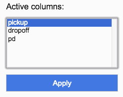
Active columns
Active columns filter columns available for visualization, menu layer, and Style and Info column selection. Unselecting columns from Active column may help reduce resource usage.
Unselecting current query result geography data columns removes the column from visualization, menu layer, and Style/Info columns. The columns remain available for selection in Active columns.
Unselecting previous query result geography data columns removes the column from visualization, menu layer, and Active columns.

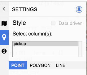
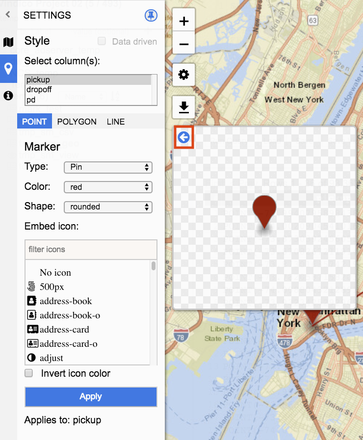
Style
Style settings enable columns to be visually customized. Customization options are based on visualization type. A preview window is available to see style changes.
Preview window
Styles can be previewed before applying to visualization. Selections made will be represented in the preview window.
The preview window can be closed by clicking on the arrow icon.

Click the arrow to open the preview window.
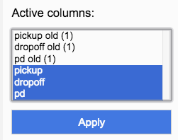
Select column(s)
Single and multiple selections can be made. Available columns are those that are selected Active columns for the current query request.
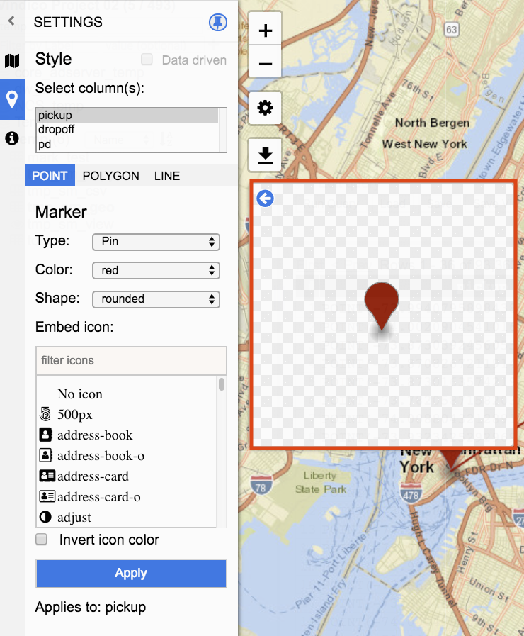
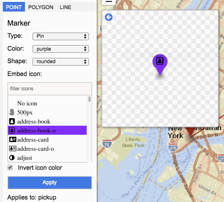
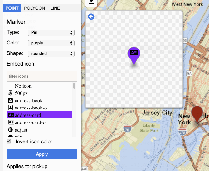
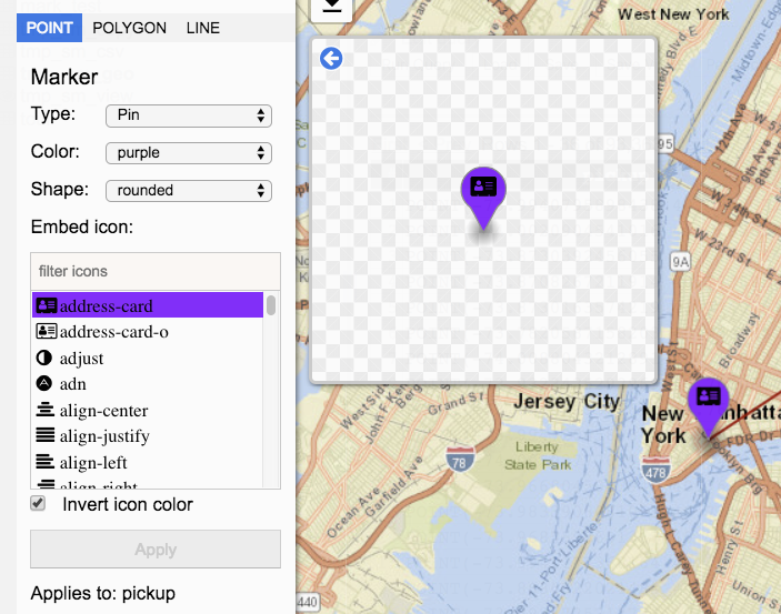
Point Styles
Point style options include marker type, color, shape, and icon.
Type represents the point. Type can be either Pin, Circle, or Heatmap.
Pin
Pin options include color, shape, and icon.
Color provides a list of available colors. Selecting a color will change the color fill of the Pin.
Shape currently has only one value which is rounded.
Icons can be embedded within the Pin. A list of icons is available and can be filtered by typing in the name of the icon.
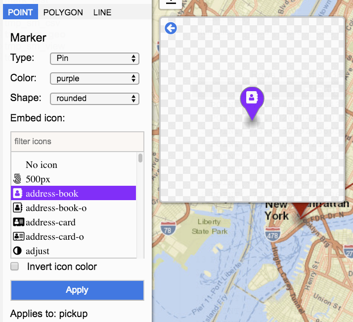
Invert icon color will change the embedded icon from white to blank.
Apply highlights when a change was made to the style that has not yet been applied. Applies to: indicates which columns the style will be set for. Style changes will not be applied to visualization until after the button has been clicked. After the button has been clicked and the style applied the Apply button will be disabled. A disabled Apply button indicates that there are no changes to apply.
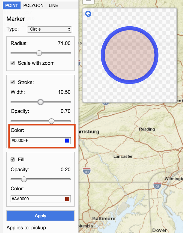
Circle
Circle options include radius, stroke width and color, and fill opacity and color.
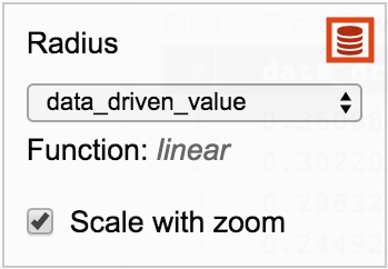
Radius determines the size of the circle. The radius can be decreased by moving the slider to the left. To increase move the slider to the right. The value is displaying on the right.
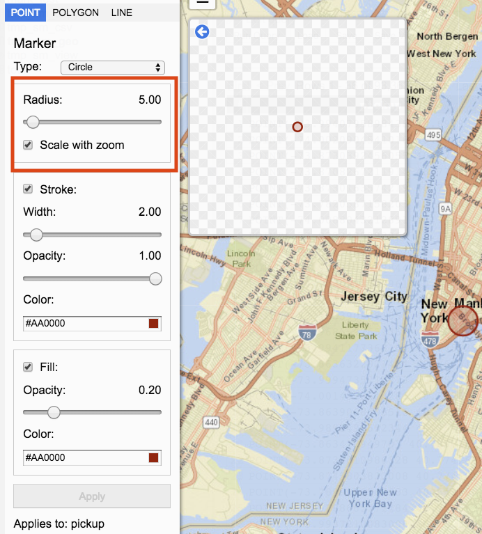
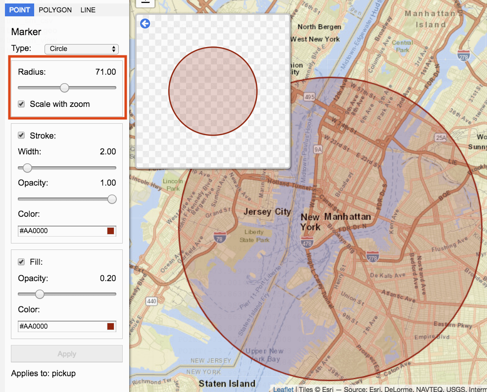
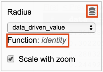
Scale with zoom
When Scale with zoom is checked, zooming in and out of the visualization will resize the circle based on the zoom. When Scale with zoom is unchecked, the circle shape will remain the same regardless of zoom.
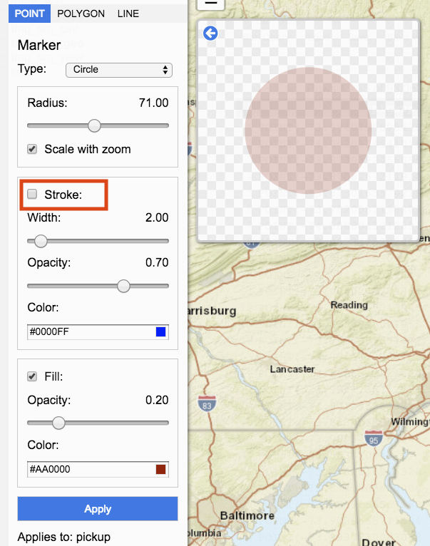
Stroke represents the circle edges.
When Stroke is checked the circle contains a visual outer edge. When unchecked, the visual outer edge is removed.
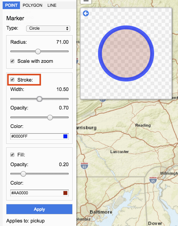
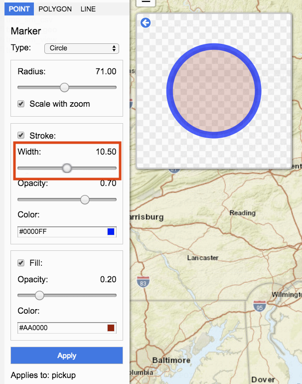
Width determines the size of the edge. Move the slider to change the width. Moving the slider to the left decreases the size of the stroke width. Moving the slider to the right increases the size of the stroke width. Value for Width is represented by the number on the right.
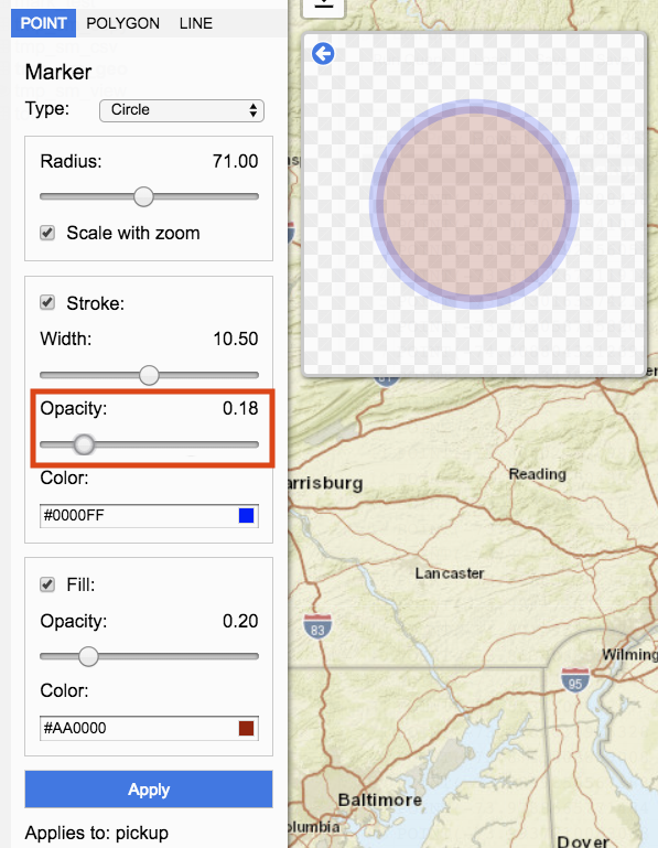
Opacity represents the transparency of the stroke. Move the slider to change the opacity. Moving the slider to the left decreases stroke opacity. Moving the slider to the right increases stroke opacity. Value for Opacity is represented by the number on the right.
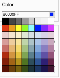
Color determines the circle edge’s color. Clicking on color input box opens a palette of colors to select from.
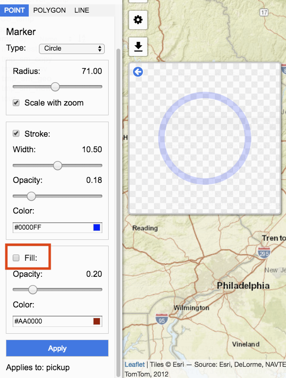
Fill
Fill represents the inner circle. When Fill is checked, the inner circle style visualized. When unchecked, the inner circle style is not applied.
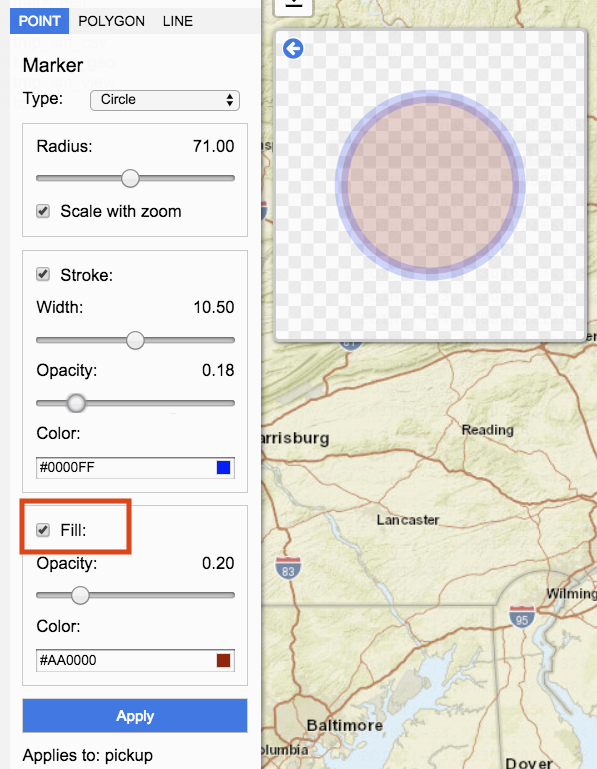
Opacity represents transparency of the fill. Move the slider to change the opacity. Moving the slider to the left decreases fill opacity. Moving the slider to the right increases fill opacity. Value for Opacity is represented by the number on the right.
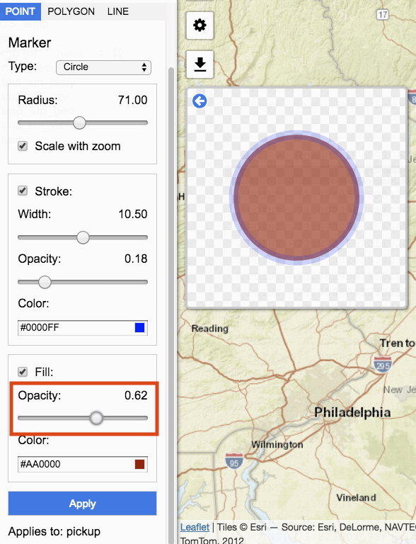
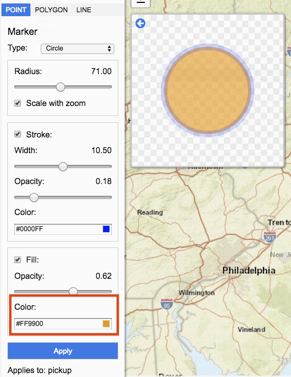
Color determines the fill color. Clicking on color input box opens a palette of colors to select from.
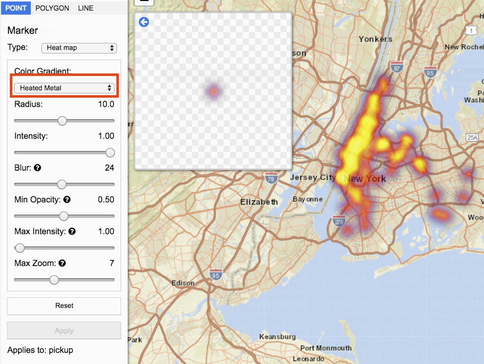
Heatmap
Heatmap visualizes multiple data points by color. Heatmap options include color gradient, radius, intensity, blur, minimum opacity, maximum intensity, and max zoom.
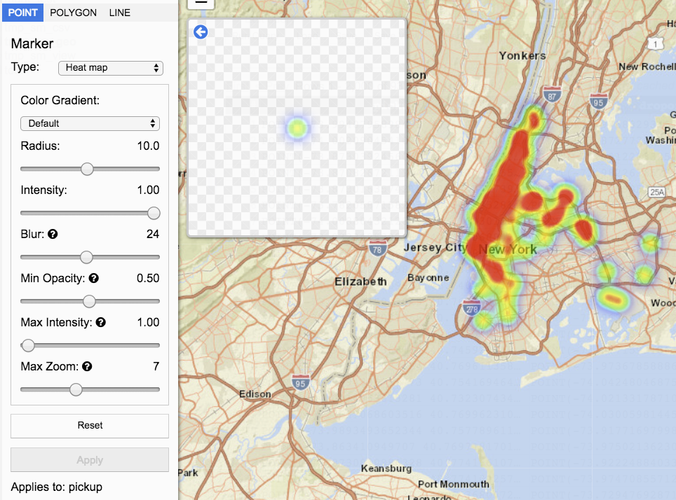
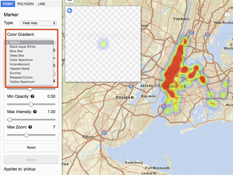
Color Gradient represents the colors to use for visualization. A list of options is available in the drop down.
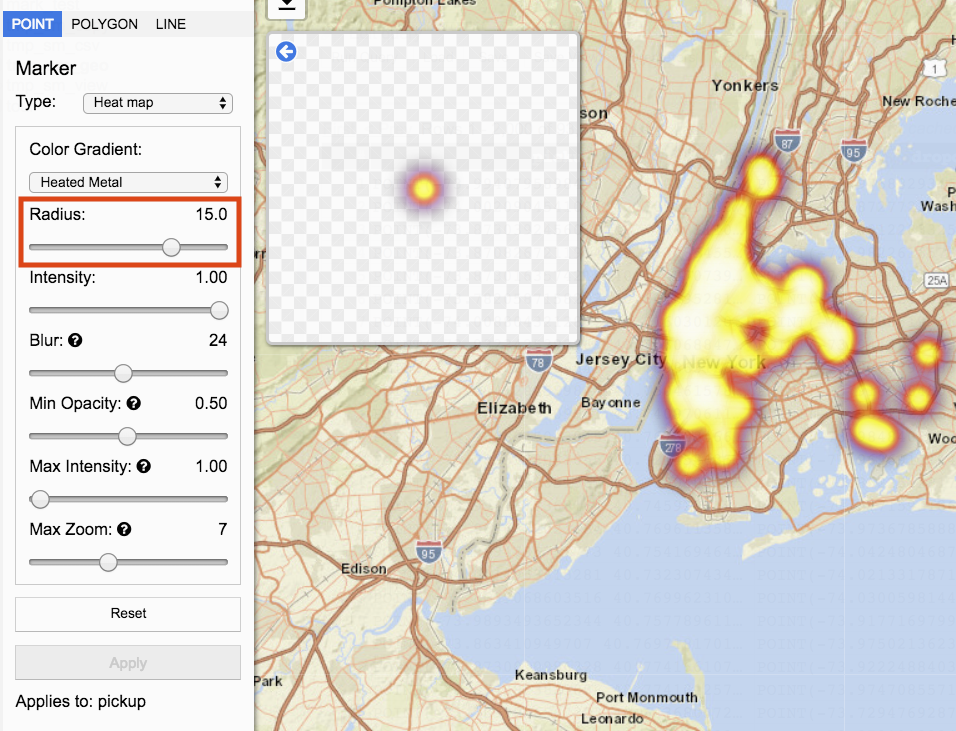
Radius represents the size of each data point that makes up the heat map. The radius can be decreased by moving the slider to the left. To increase move the slider to the right. The value is displaying on the right.
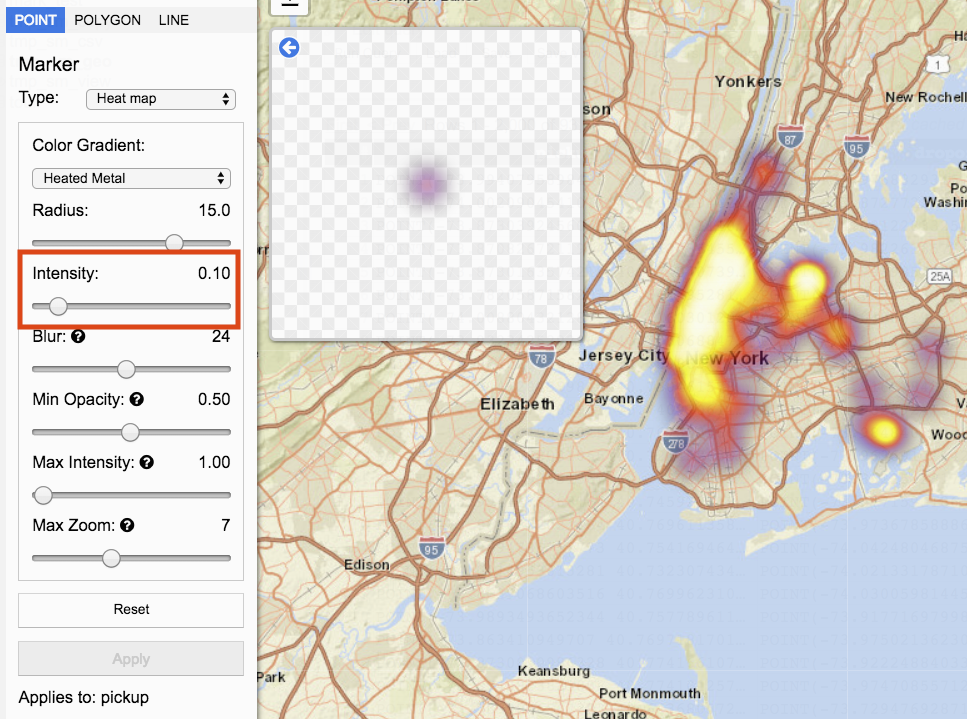
Intensity determines the strength of the visualization for each point. Intensity can be decreased by moving the slider to the left. To increase move the slider to the right. The value is displaying on the right.
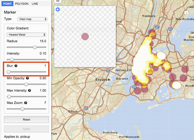
Blur represents the amount of dispersal data points have. Blur can be decreased by moving the slider to the left. To increase move the slider to the right. The value is displaying on the right.
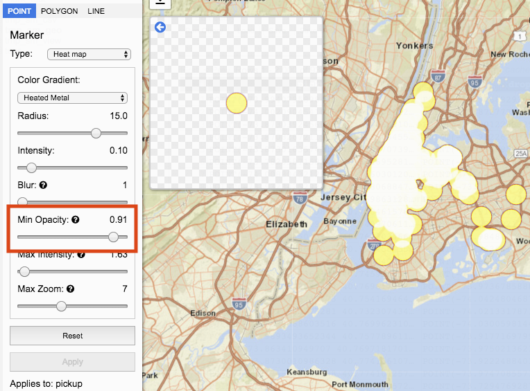
Min Opacity sets the lowest opacity available for the heatmap.
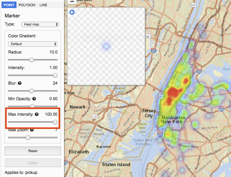
Maximum Intensity sets the maximum intensity available for the heatmap.
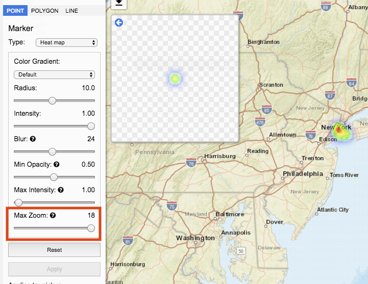
Max Zoom sets the zoom level the point will have maximum intensity.
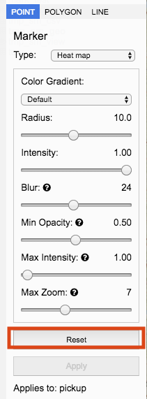
Reset
Clicking the Reset button sets all Heat Map options to their default value.
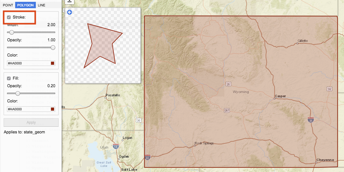
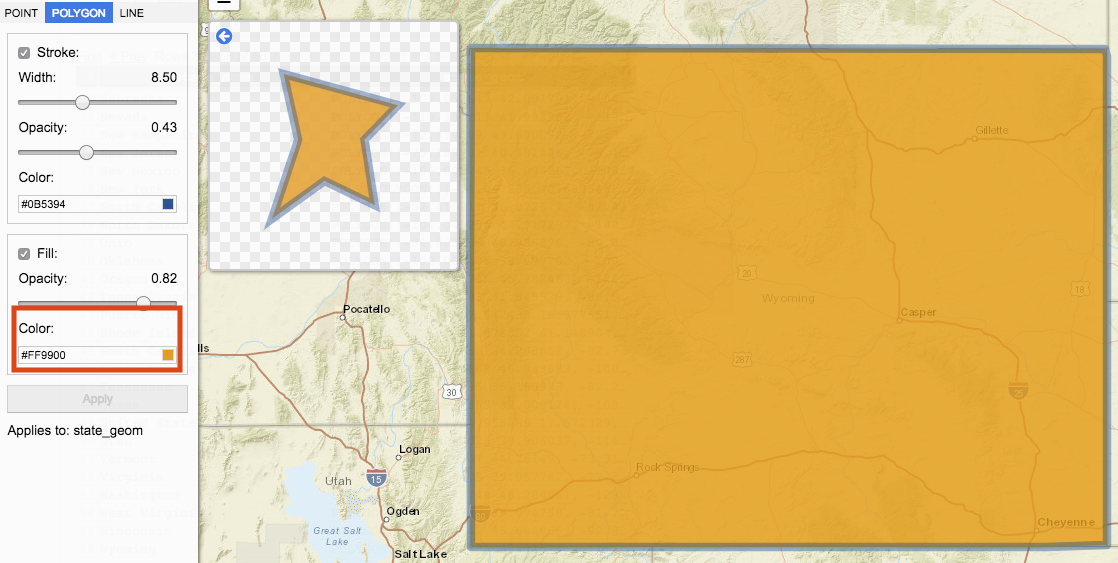
Polygon
A polygon is a geography type with three or more sides. Polygon Style options include Stroke width, opacity, and color, and Fill opacity and color.
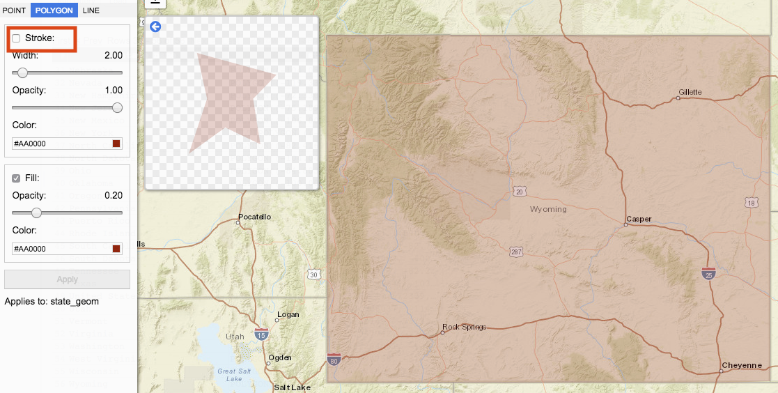
Stroke represents the polygon edges.
When Stroke is checked the polygon contains a visual outer edge. When unchecked, the visual outer edge is removed.
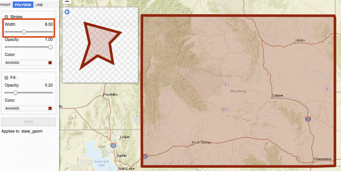
Width determines the size of the edge.
Move the slider to change the width. Moving the slider to the left decreases the size of the stroke width. Moving the slider to the right increases the size of the stroke width. Value for Width is represented by the number on the right.
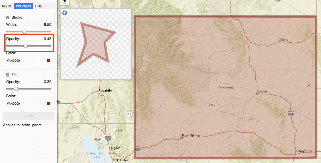
Opacity represents the transparency of the stroke. Move the slider to change the opacity. Moving the slider to the left decreases stroke opacity. Moving the slider to the right increases stroke opacity. Value for Opacity is represented by the number on the right.
Color determines the polygon edge’s color. Clicking on color input box opens a palette of colors to select from.
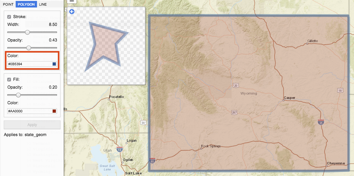
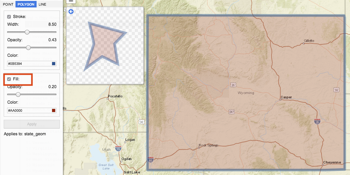
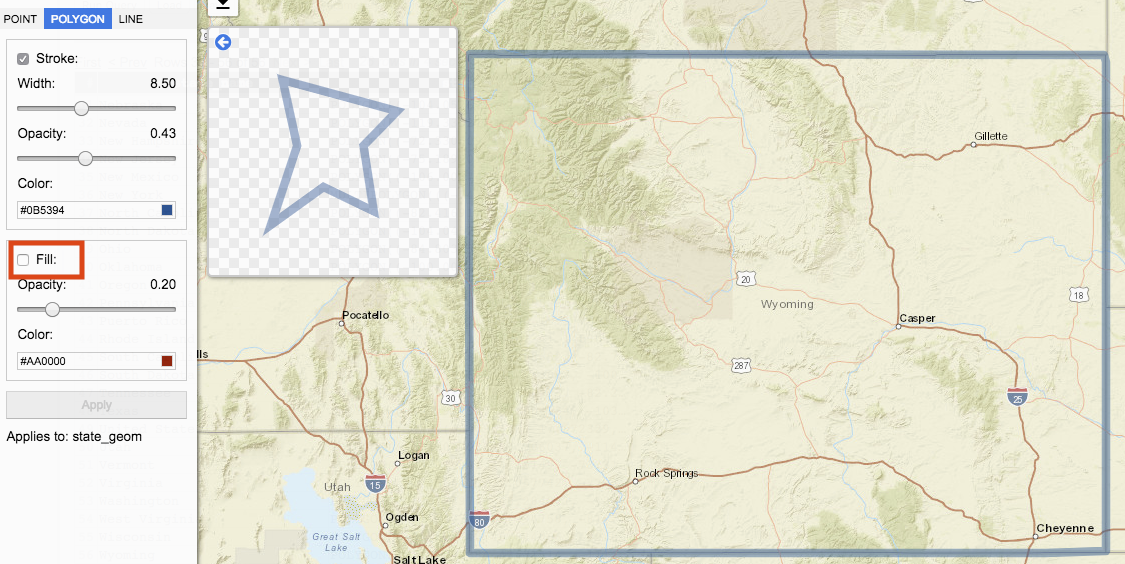
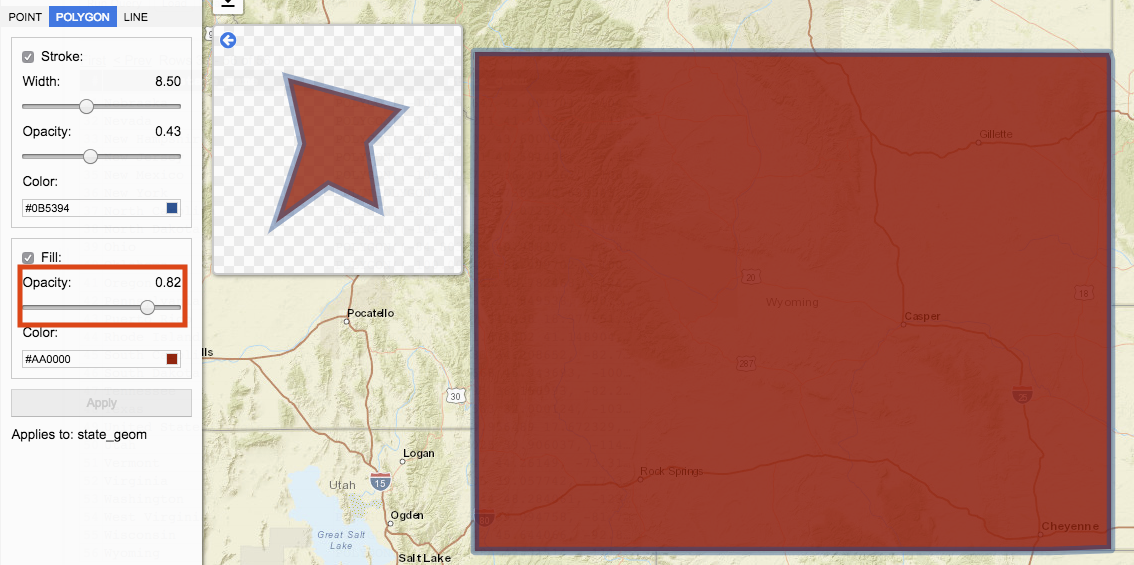
Fill
Fill represents the inner polygon. When Fill is checked, the inner polygon style visualized. When unchecked, the inner polygon style is not applied.
Opacity represents transparency of the fill. Move the slider to change the opacity. Moving the slider to the left decreases fill opacity. Moving the slider to the right increases fill opacity. Value for Opacity is represented by the number on the right.
Color determines the fill color. Clicking on color input box opens a palette of colors to select from.
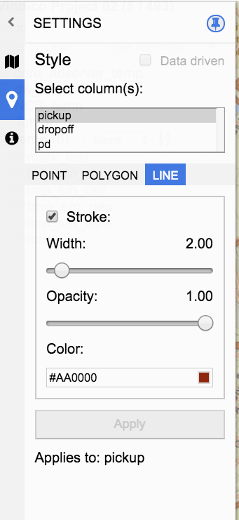
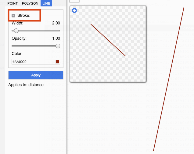
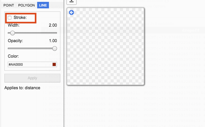
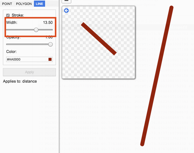
Line
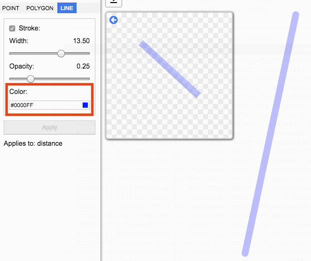
A line is a geography type connecting two data points. Line style options include Stroke width, opacity, and color.
Stroke determines whether or not the line will be visualized.
When Stroke is checked the line is visualized. When unchecked, the line is not visualized.
Width determines the size of the edge. Move the slider to change the width. Moving the slider to the left decreases the size of the stroke width. Moving the slider to the right increases the size of the stroke width. Value for Width is represented by the number on the right.
Opacity represents the transparency of the stroke. Move the slider to change the opacity. Moving the slider to the left decreases stroke opacity. Moving the slider to the right increases stroke opacity. Value for Opacity is represented by the number on the right.
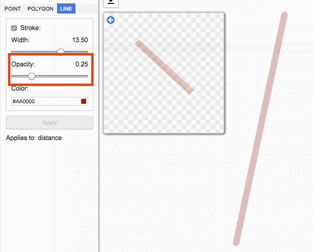
Color determines the circle edge’s color. Clicking on color input box opens a palette of colors to select from.
Data driven
A data driven column is a non-geography data column whose value is used in place of specifying a value. Data driven columns are available to be used when styling Point-Circle, Point-Heatmap, Polygon, and Line.
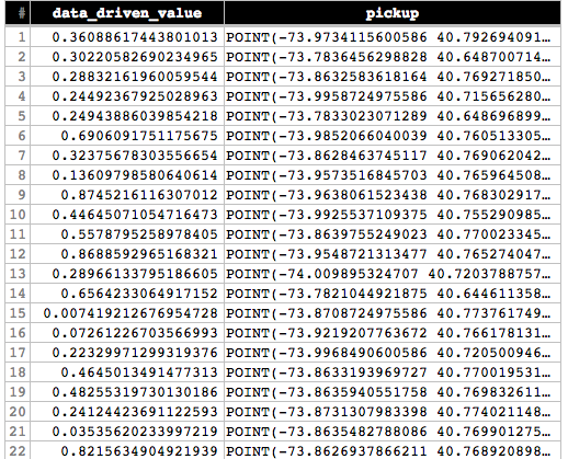
To set a Style value to data driven construct a query that returns both non-geography and geography data. For example, a query can return data to represent the width or opacity for geography type.
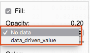
Visualize the data and navigate to Style. Check on Data driven to set data driven values. When checked data driven drop down options become available.
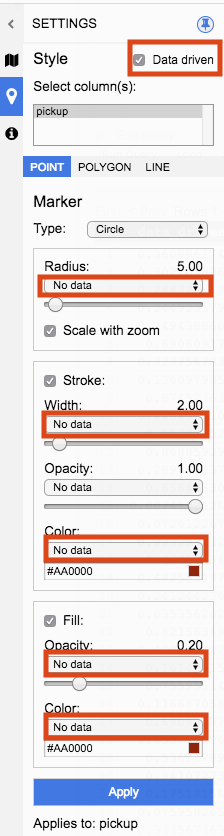
Clicking on the data driven drop down will list all available non-geography data columns to select from.
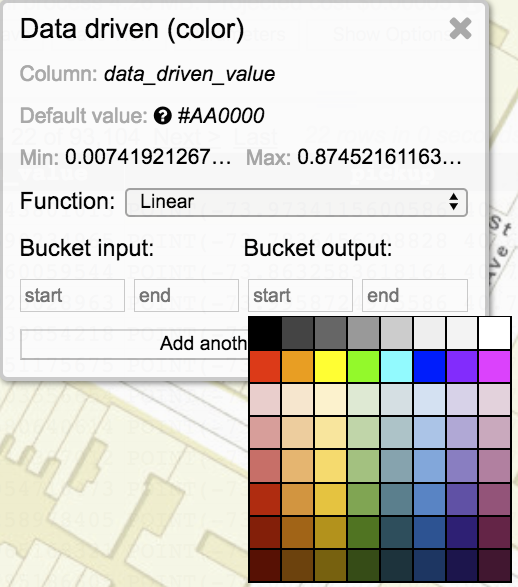
Data Driven Pane
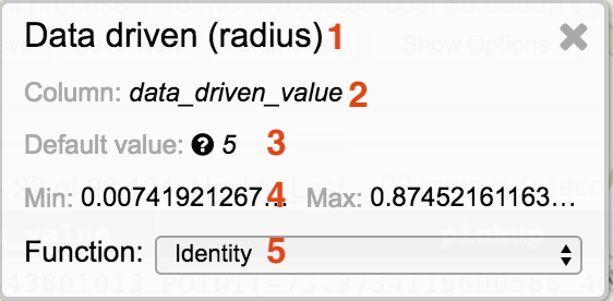
Selecting a data driven column will display the function in use and an icon that will open/close the data driven Pane.
The data driven pane replaces the preview window.
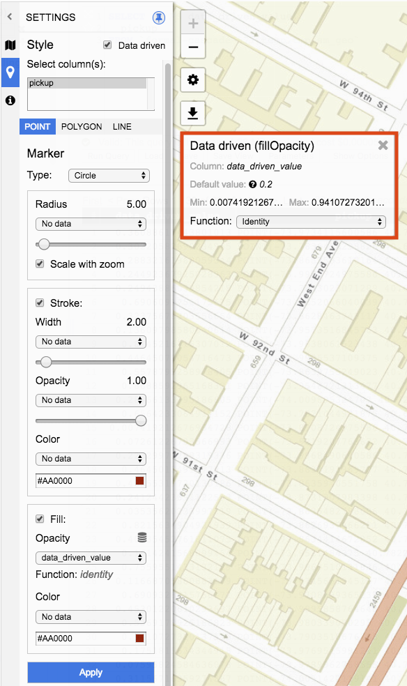
- The panel header includes the style being set to data driven values. In the example above Fill Opacity values are set.
- The column to be used as values. In the example above the query result contains a column named data_driven_value whose values will be used for opacity.
- The default value used in cases where the selected data driven value is invalid. To set the default value set the style to No data and use the slider to set the desired value. This value will be used as the default value when data driven functions are selected.
- Min and Max values in the selected data driven column present in the current query result. Only values from the current query result page are used to calculate the min and max values. In the example above the current query result page for data_driven_value column has a minimum value of 0.0074 and maximum value of 0.9410.
- Function used to transform the data driven value. Function options include Identity, Linear, Interval, and Category. In the example above Identify is being used as the function.
Data Driven Functions
Function options include Identity, Linear, Interval, and Category.
Identity
Data driven styles set to function Identity will set the style to the value of the data driven column.
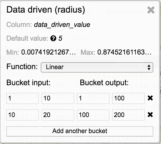
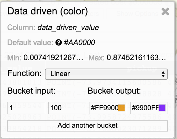
Linear
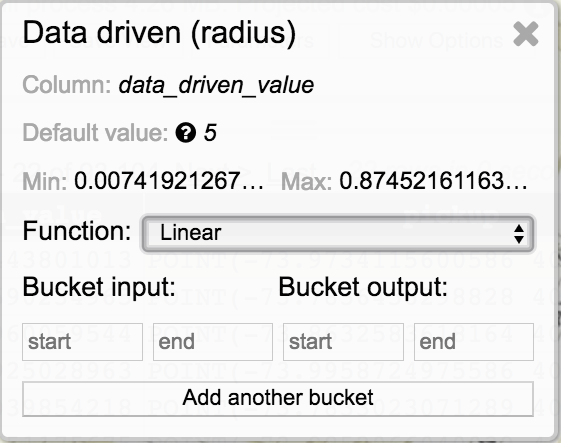
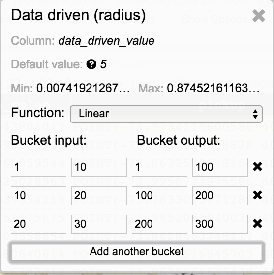
Data driven styles set to function Linear will have linear interpolation applied to values within the start and end bucket input transformed to a value within the range of the start and end output.
A bucket is defined by adding input and output values for the start and end. In the below example, any value for the data driven column within the range of 1 and 100 will be transformed, via linear interpolation, to a value of 1 and 100. The output value is only applicable to the style. The value will not be transformed in the query results.
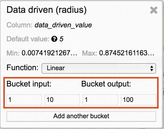
To add additional buckets, click on Add another bucket.
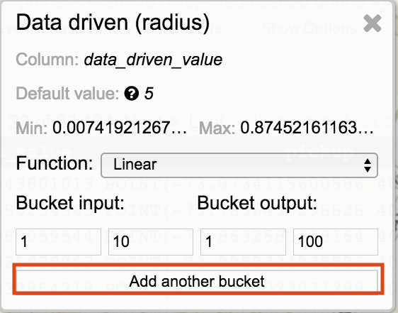
To remove a bucket, click on the X icon.
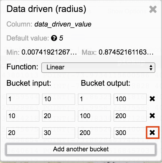
Value Outside Bucket Range
Data driven values that are outside of the bucket input ranges will be set to the closest bucket input range. For example, if bucket input value ranges are 1 through 10 and another bucket is 20 through 30, a data driven value of 12 will be assigned to the bucket input range of 1 through 10 with the output value being set as if the input value were 10.
Interval
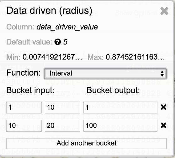
Data driven styles set to function Interval will have values within the start and end bucket input transformed to the bucket output value.
A bucket is defined by adding input and output values for the start and end. In the above example, any value for the data driven column within the range of 1 and 10 will be transformed to a value of 1. The output value is only applicable to the style. The value will not be transformed in the query results.
Category
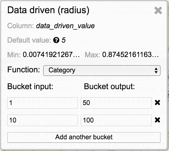
Data driven styles set to function Category will have the bucket start input transformed to the bucket output value.
A bucket is defined by adding an input and output value. In the above example, any value for the data driven column that is 1 will be transformed to a value of 50. An input value of 10 will be transformed to 100. The output value is only applicable to the style. The value will not be transformed in the query results.
Color
Currently color styles only accept hex values. #AA0000 is an example of a hex color value. Data driven column results that contain hex values and are set to function Identify will have the style applied to the value in the data driven column.
For Linear, Interval, and Category functions a color palette is displayed when clicking within the bucket output field on a color style. Bucket input values will be transformed to the selected bucket output color.
Validation Hints
Data driven selections provide validations hints. These are validation suggestions and do not prevent users from applying incorrect inputs. Bucket input fields will highlight with red indicating a possible issue.
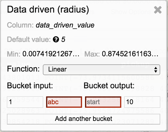
In the example above, validation hints are highlighting issues with string values in bucket input end and an empty field for bucket output start.
The data driven icon will color code based on validation hints.
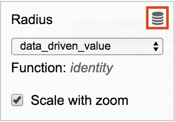
A grey icon indicates that the default function, identify, is set.
A red icon indicates that there are validation hints in bucket assignment. Open the data driven pane to view the validation hints.
A green icon indicates that no validation issues were identified.
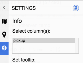
Info
Info enables adding tooltips and popups to geography data visualization along with setting a title on the footer of the JSON viewer window.
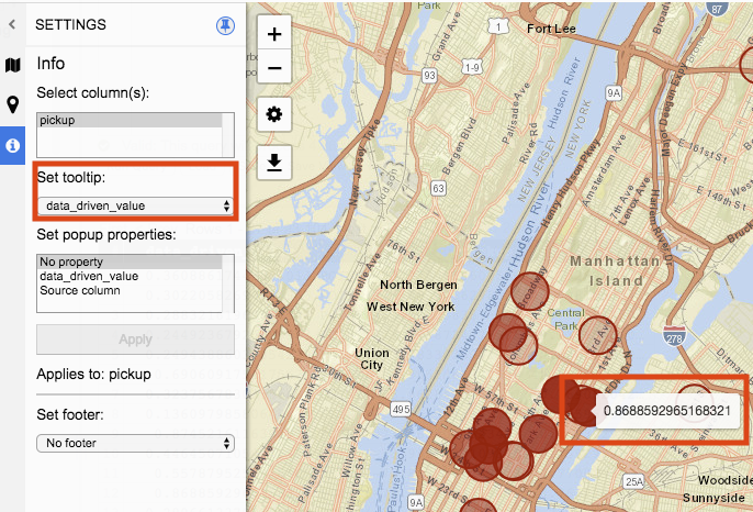
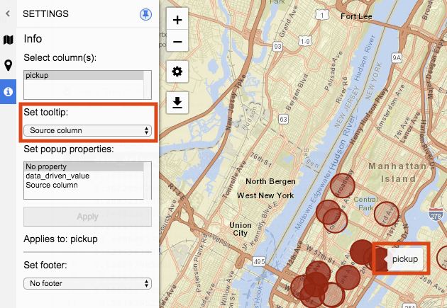
Set tooltip
Tooltip is a window that will display when hovering over a visualization object. The value displayed in the window corresponds with the value selected in the drop down.
Tooltip drop down options include No tooltip, any non-geography data type columns from the current query result set, and Source Column.
No tooltip will not display a window when the visualization object is hovered over.
When a data driven column is selected the value on the same row for that geography data object that is hovered over will display.
Source column displays the title of the column when the geography data object is hovered over.
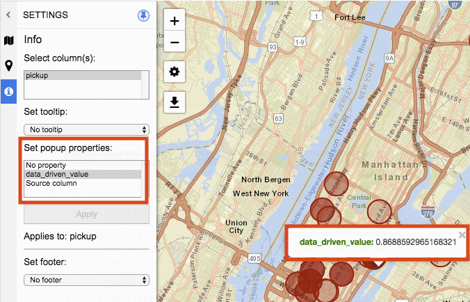
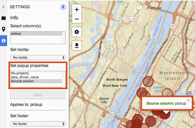
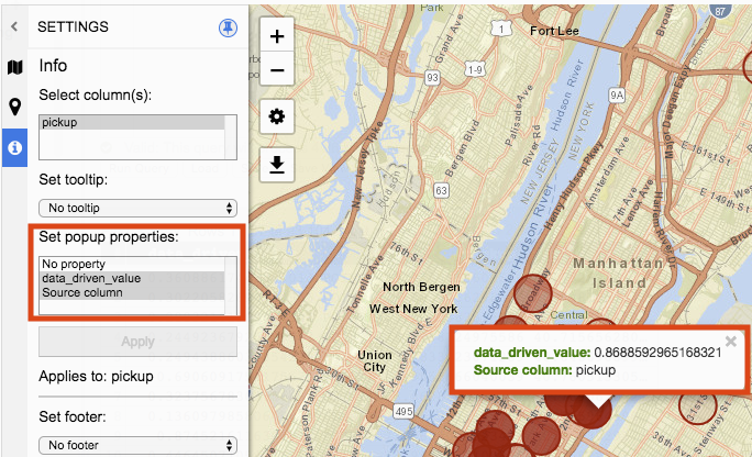
Set popup properties
Popup properties open a window when a geography data object is clicked on. The value in the window is represented by the options selected in Set popup properties. Multiple selections can be made.
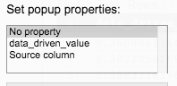
No Property does not display a window or enable a geography data object to be clicked on.
Selection of data driven values will display the value that is on the same row of the geography data object being click on.
Source column displays the title of the column when the geography data object is clicked on.
Selecting multiple popup properties will display them all in the popup window.
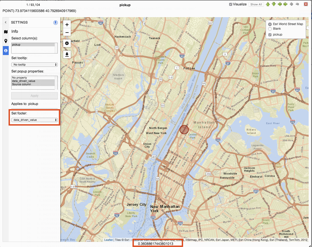
Set footer
Set footer drop down options include No footer and any non-geography data column from the current query result set.
No footer does not display any values for the footer of the JSON viewer window.
Selecting a non-geography data column will display the value of the column from the current row being navigated.